Branding and Identification
Questionnaire: Personal Graphic Design
Company
General company information:
*Company Name (Fill this in) ___Maize____
What product
or service does your business offer? Graphic Design. Illustration for various companies and
products.
Who (age/gender)
is your target audience and who is your most ideal customer (economic
status/education etc)? (Fill this in)___companies
that are starting out or local businesses____
How would you describe your services and/or products? Logos, Websites, Printed design, t-shirts,
etc.
Who are your
competitors and how do you differ from them?
Other graphic designers. I have
different ideas (that’s what everyone else says right?).
Please
provide general information about your business. (Fill this in) I’m a free-lance graphic designer and I want to work
with small companies or local businesses.
What is the overall mood of the
company? Serious about creating a good product, but open to creative input.
Logo information:
Your logo will be used in print, website, video media. (keep this in mind) SIMPLE, MEMORABLE, SCALEABLE
Fill in ALL questions below
If you want your company name to appear in the logo, what is
the exact name as you would like it to appear in your logo? Maize
What is the overall message you wish to portray (serious,
playful, etc) ? A little bit playful and friendly, but a little down to earth
as well.
Do you have any color preferences? Yellow or green maybe,
but no red or pink.
What feeling or message do you want your logo to convey to
those who view it? That I’m just trying to help.
Do you envision something techy (squarish, modern) or more
organic (natural, soft, roundish)? More organic and natural.
Reference:
Research and Reference:


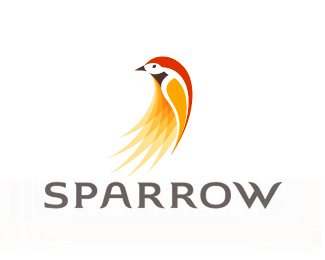
I
also like this one because of the animal theme. I also like its warm colors
that go together well, but are not overly bright. It also is kind of simplistic
and has some texture as well as a link to the name.


Yes, yes. I know that most of the ones I liked had animal themes, but those were the ones I liked that I found on Google Images, and three of them are for graphic designers.
By the way most of the information for the "Questionare" is false, so don't take anything that is on there too literally.
No comments:
Post a Comment